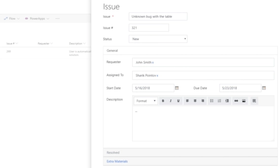
SharePoint Online Custom Form in the List Panel (Office365 Modern UI)
SharePoint Online Custom Form in the List Panel (Office365 Modern UI)
SharePoint Online has introduced its new UI and layout in the year 2016, and it has since grown in size and has been added to SharePoint 2019.
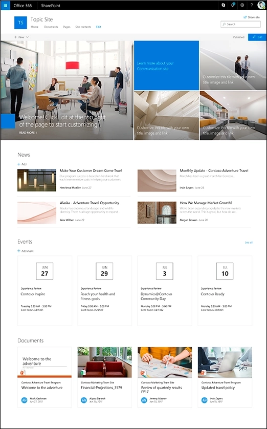
You might be wondering what the differences are, or if you are familiar with both, you might still want to know some hidden details and behind the scene mechanisms that make Modern UI different, and in some ways — objectively better.
Both types of UI still have their time and place, and the amount of possible customization varies, but as the time goes by, mobile devices get more and more prevalent, and features of Modern UI continue expanding — making it more and more appealing with every day.
So, what does SharePoint Modern UI bring to the table?
One of main driving forces that shape modern web and new SharePoint UI is the drastic increase in use of mobile devices. This has been a factor for a long time, and with each passing day it is harder and harder to ignore: mobile devices are used by employees to stay in touch on all the latest progress, but they are also used in professional environment.
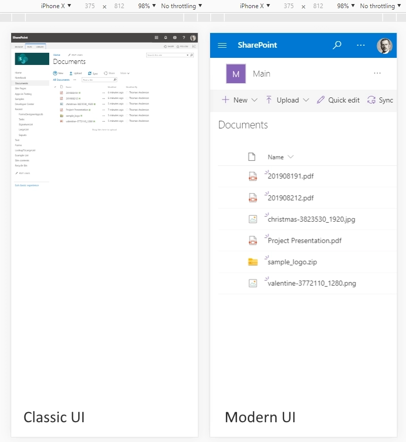
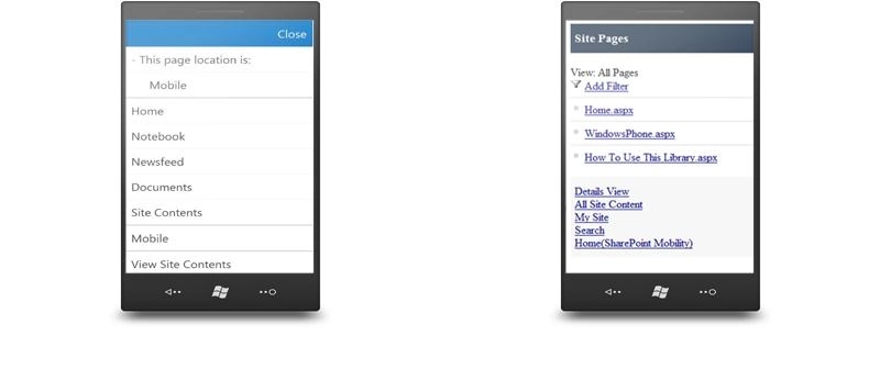
Full screen version of classic UI is very hard to navigate on mobile devices. Previously SharePoint allowed the approach of separating mobile content from the main content. You might remember some sites using mobile versions in the past, and as you might be aware this has been possible for SharePoint as well, using Contemporary view or Classic view options — but this separated content and limited control users had working with the sites.
Modern UI on the other hand keeps all the pieces together and adjusts the layout to each device. This approach is known as responsive — it responds to the size of the screen. Microsoft uses Office UI Fabric framework, which is a grid based framework — instead of HTML tables, it uses flexbox grid with several breakpoints where the content is compacted for mobile devices.
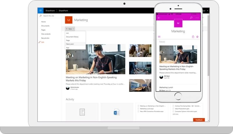
Previous version of SharePoint UI was developed long ago, before Microsoft 365 and its services became a thing, and originally, the classic UI was the only option for SharePoint Online.
That meant that while SharePoint Online was a part of Microsoft’s Microsoft 365 services, it wasn’t well-integrated, most of its features were self-sufficient, but cut off from the rest of the platform. The only exception was for creating or editing documents.
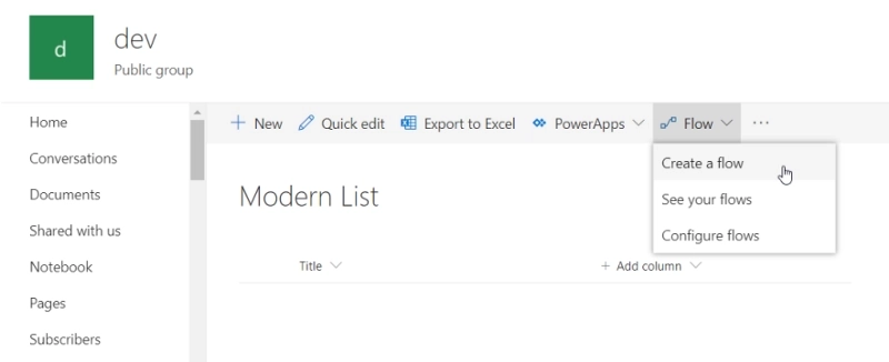
This is different for Modern UI — it’s much more integrated with other services of Microsoft 365. The obvious example is integration with MS Flow (aka MS Power Automate), where you can use not only SharePoint actions, but actually connect all parts together. Flows can be configured from Modern UI:
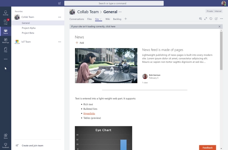
MS Teams can include modern SharePoint pages in tabs:
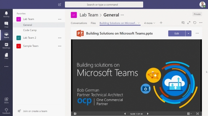
It’s also possible to put a whole document in a tab, for example, a presentation for the whole team to see:
There are many other ways to integrate modern SharePoint with MS Teams.
Modern SharePoint sites are also using Microsoft 365 Groups, which connects new sites to real Exchange calendar and Outlook mailbox, a real OneNote notebook, a Planner plan, and other services of Office365. This brings everything even closer together, allowing users to integrate all these tools with SharePoint.
Moreover, even Search bar in Modern UI searches across all of Office365, instead of just SharePoint:
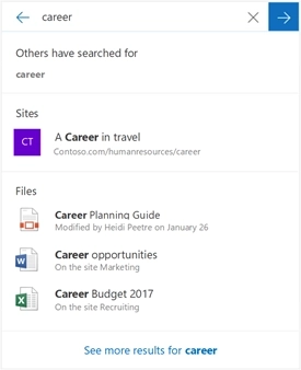
Along with other changes, usability and optimization has been drastically improved — this will make creating new sites easier, while maintaining and running them will be smoother (at least, in theory!)
The main drive behind speed increase is the move away from server rendering which was used for every page in classic UI. Most of the page was created on the server and sent over the network to the user, creating bottlenecks and slowdowns. In some extreme cases, the pages even failed to render in time, causing an error to appear instead of the page.
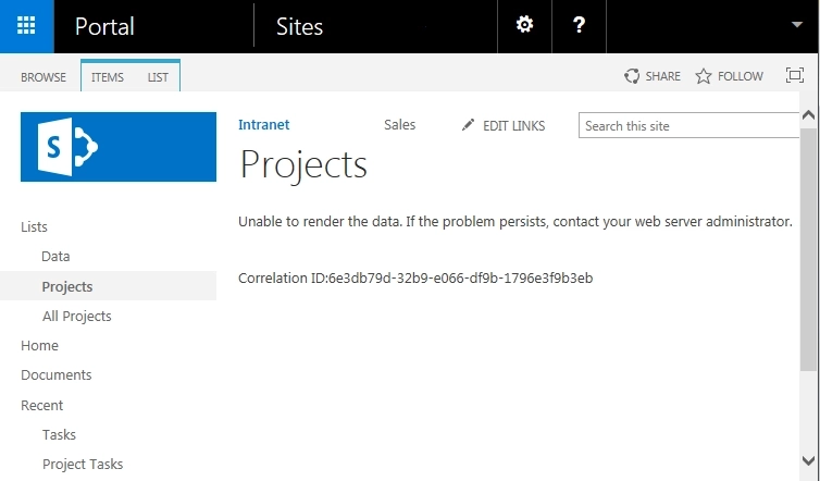
Modern UI renders most of the page in the browser, while bigger files (such as SharePoint Framework) are stored outside of SharePoint servers, closer to the end-users on Content Delivery Networks (CDNs). A lot is also cached on the client’s machine, and most of the time only the content needs to be retrieved.
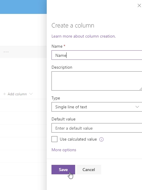
But that’s not the only speed increase you’ll get with Modern UI, as the process of working with files and items has also gotten easier. For example, Modern Libraries allow dragging and dropping files, List columns can be created, hidden or shuffled right in List View, without going to List Settings.
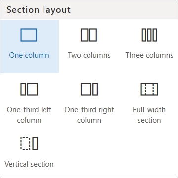
There are many page layouts you can choose from in Modern UI, but all of them adjust well to mobile devices. Moreover, you can switch page layout after a page is created:
And there are many other small changes you might not notice straight away. Modern UI has usability and ease of use as its core, essentially reducing the need to employ quite as many technicians and admins on every single task . Most simple tasks can now be done by just about anyone after a short training, or even without it — it’s just that simple!
There is always a catch and switching to Modern UI is no exception. While there are many advantages, there are still some disadvantages that might prevent you from switching to Modern UI.
As I’ve said before, the UI has been streamlined and simplified to make it lighter, more mobile-friendly and more approachable, but this has also lead to a broader standardization and overall similarity between sites. Gone are the master pages and the flexibility with which you could modify the look and feel of your sites. This can be critical if you need some complex functionality!
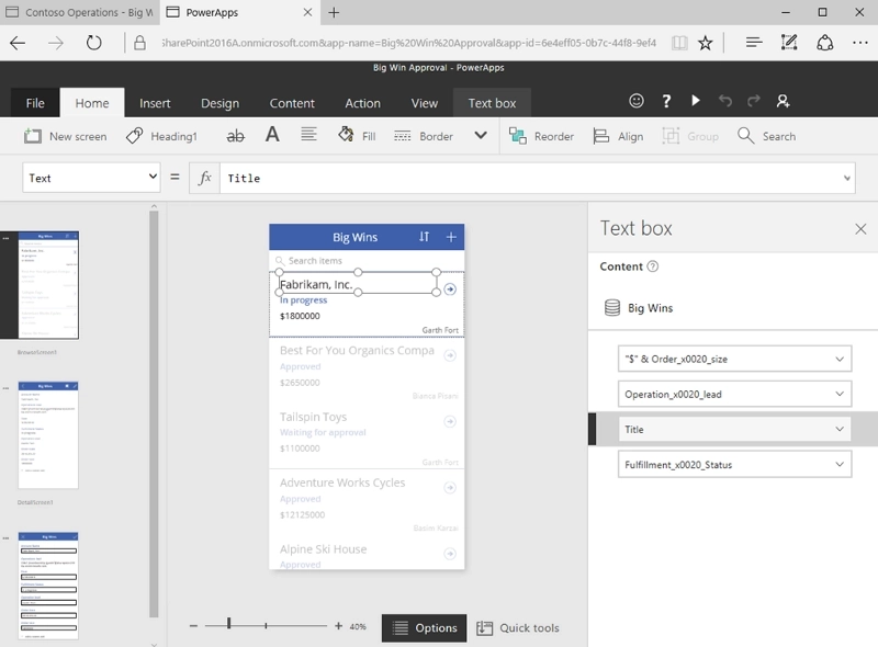
You can use PowerApps to customize forms for SharePoint lists and libraries for Modern UI, and it’s a great tool, but it also lacks a lot of flexibility of Infopath forms.
If you are looking for a solution to customize Modern UI Forms and keep them complex as they’ve used to be, but also responsive and mobile-friendly, I recommend to check out our application — Plumsail Forms for SharePoint, which works for both SharePoint Online and SharePoint 2019.
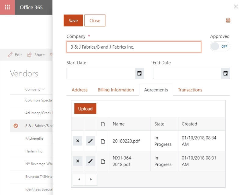
Our solution supports both full screen and panel forms, and it offers not only a large amount of new controls and containers, such as Tabs, Accordion, Wizard, and Ink Sketch, DataTable, etc. — but also offers rich JavaScript API and complex routing system to provide different forms for different users.
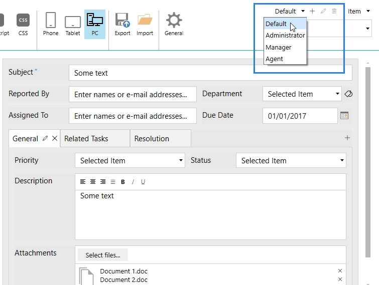
While we cannot support SharePoint mobile app at the moment — Microsoft has restricted customization of forms there, our forms can be used on mobile devices via the browser such as Safari or Chrome, and they’ll adjust to mobile screens, plus you can specify extra rules on how to adjust.
If customization in general and forms customization in particular is one of the issues you are concerned about going forward to Modern UI, we recommend to give our product a try — 30 days Trial is free!
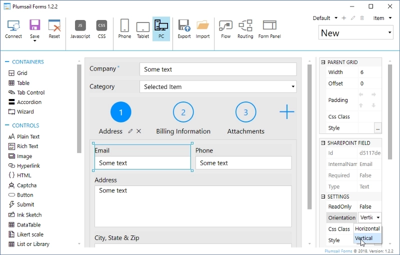
Decide for yourself, if Plumsail Forms is a tool worth using or if you’d rather stick to PowerApps solution. Whatever you decide, I hope this article has been helpful in understanding the core ideas behind Modern UI and why switching to it might be preferable in the nearest future.