Modern and classic SharePoint UI — differences and advantages of switching
What’s this Modern UI all about?
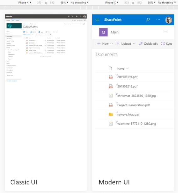
With Modern UI, new possibilities are available to SharePoint On-Premises. One of them is the ability to have new responsive and mobile-friendly forms, which would open directly in a panel, like default forms, but will come with much improved functionality.
Our product, Plumsail Forms, allows you to modify New, Edit and Display forms for SharePoint Lists (and Edit/Display properties forms for Document Libraries), enhancing them with new controls, containers, improved fields, and powerful JS API.

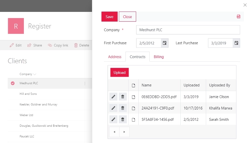
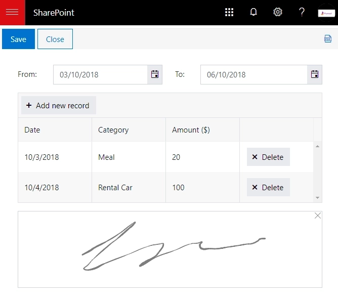
For example, now you can split form into parts using Accordion, Tabs or even Wizard container. You could also add a DataTable or a Likert Scale control to the form, and even a signature field.

There are other possibilities as well. List or Library control allows adding another list to the form, which can then be modified directly on the form. Lookup fields now support search and filtering.

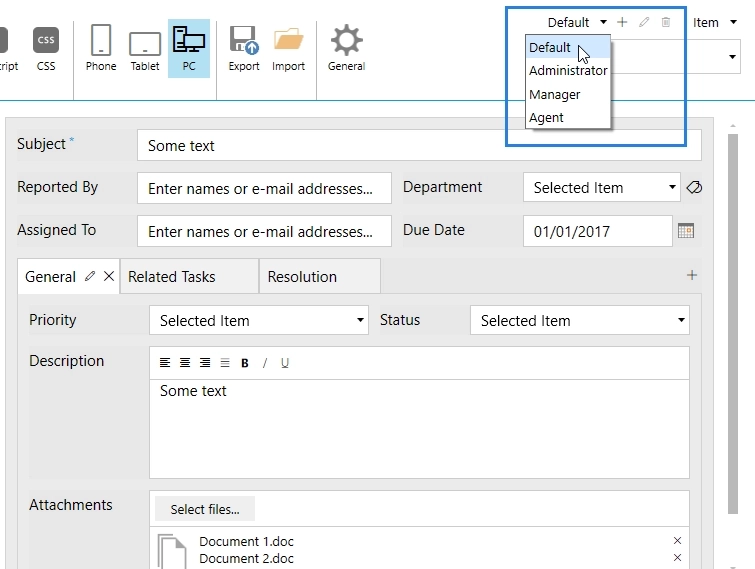
Most importantly, you get much freedom with scripting. Create several form sets and redirect users to specific form set based on any condition — are they from the correct department, or are they filled in one of a Person fields on the form? You can apply custom scripts for validation, data duplication, conditionally hide fields, and more.

This solution also has no limits on the number of fields per form. If SharePoint List can handle this amount of data per row, then so can the form. No more annoying limitations of 70 fields per form, no more “Unable to display this Web Part” error — these days are gone.
Give Plumsail Forms a try, and see what it can do for SharePoint 2019.