Create a new chart
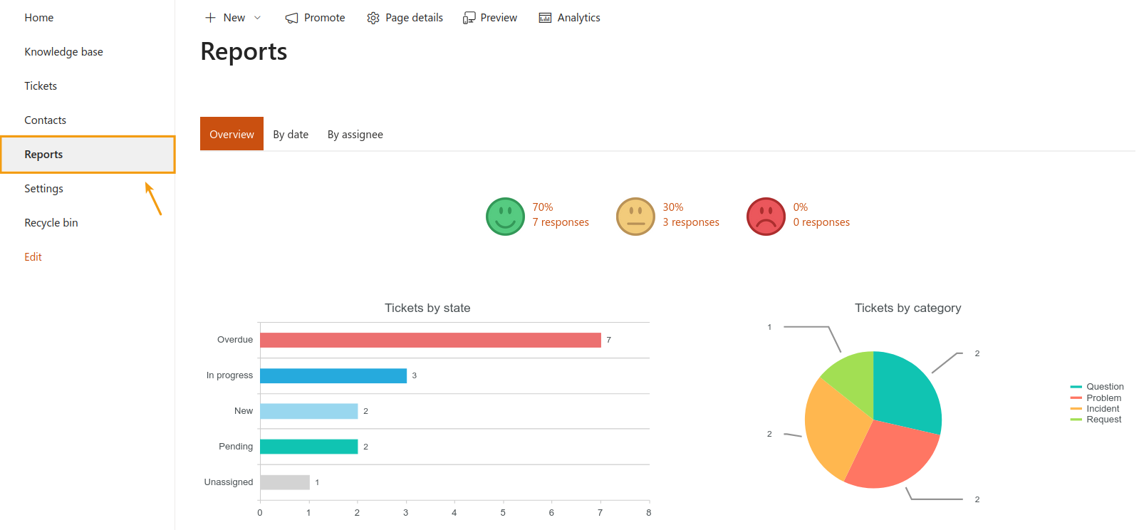
In HelpDesk, you have some built-in charts in the Reports section, but you can also create your own chart with the help of Dashboard Designer. Here is a step-by-step instruction on how to do that.
First of all, download Dashboard Designer. It will be automatically embedded into HelpDesk, and you will find it in the site contents.
For example, let’s say you want to figure out which department in your company has the largest number of tickets. Note that Department is a custom field with a choice type of information.
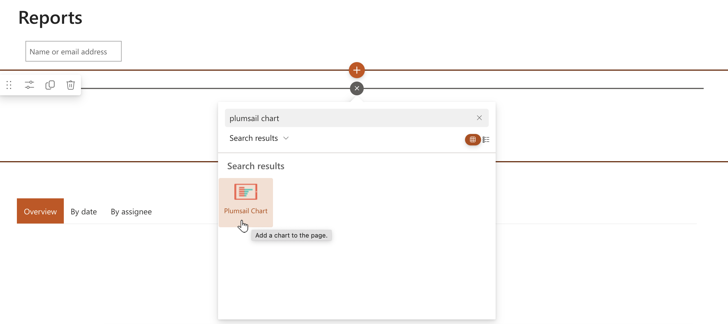
To build a new chart, go to Reports in the left navigation menu, and then select Edit page in the ribbon menu.
Choose the page area where you’d like to put a chart, click on Insert in the ribbon menu, select Plumsail chart, and don’t forget to save the page.
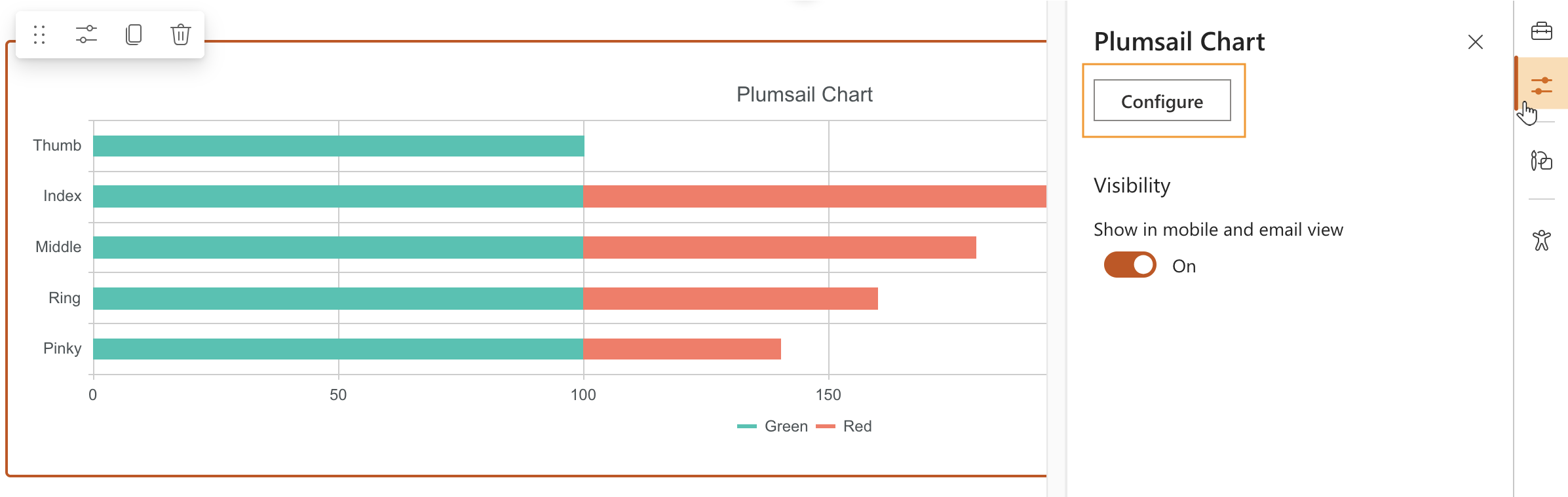
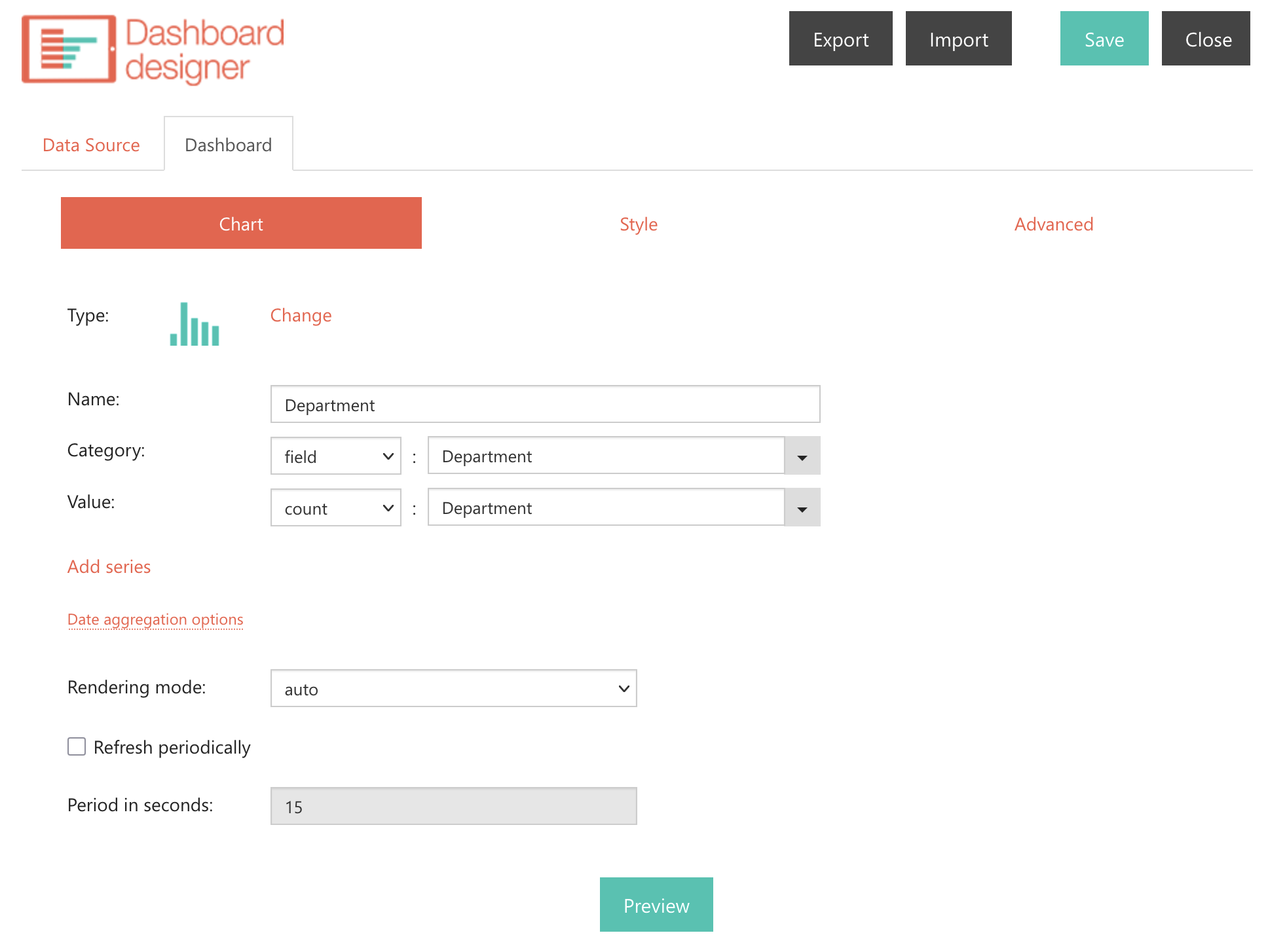
The default chart will be inserted into the page, and you can now configure it. Click Configure in Properties from the right menu to launch Dashboard Designer.
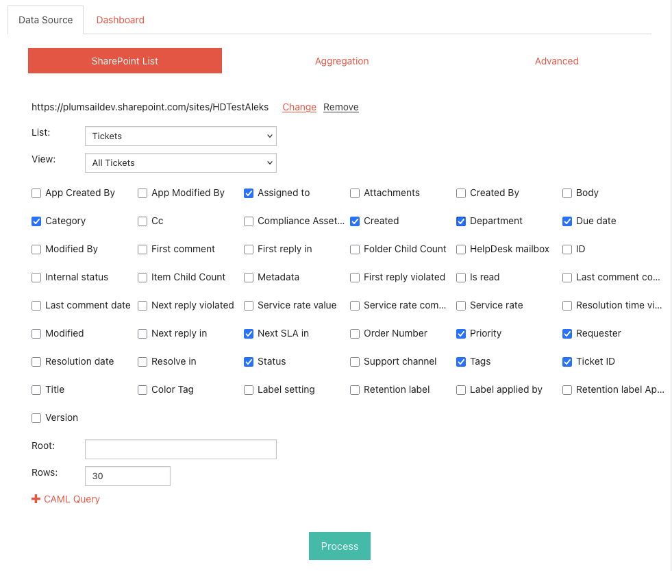
Next, you need to input data. Since you are using SharePoint data as a data source, define a list and its corresponding view. In this example, the Tickets list is selected.
Then, select the required fields and initiate the process by clicking the Process button.
After the process is complete, you are ready to create a chart. In Dashboard Designer, you have plenty of options for charts and graphs to choose from. For this case, the best way to visualize the data is a column chart.
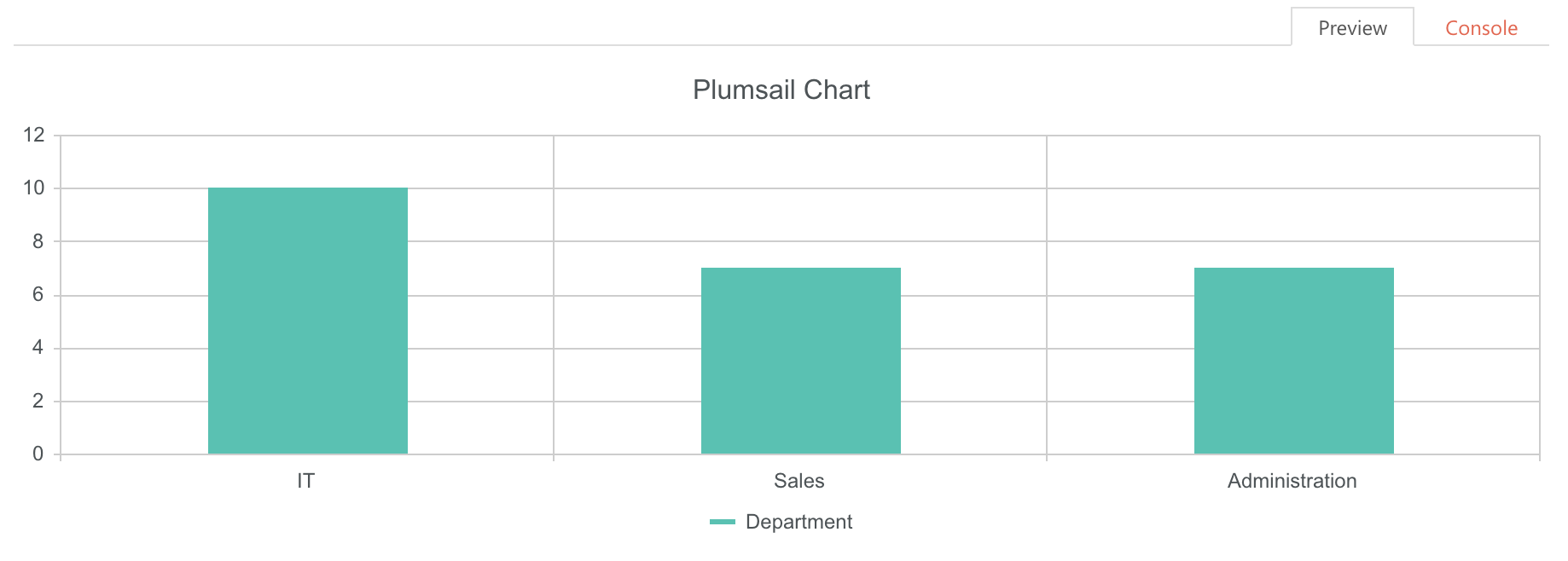
Click Preview to see your new chart, which shows that the IT department has more tickets than the others.
Don’t forget to Save your chart, and that’s it.