Org Chart
Customer Story
Nov 06, 2025
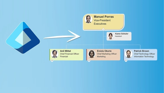
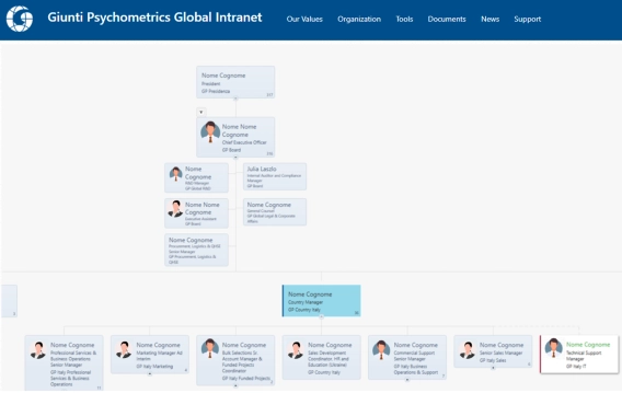
How live SharePoint org charts replaced manual PowerPoint diagrams at Giunti Psychometrics
Learn how Giunti Psychometrics moved from time-consuming PowerPoint updates to live org charts directly in SharePoint.

Have you ever had a feeling that your Org Chart does not provide you the info you need? Sometimes just viewing is not enough. To get a better grip on your Organizational structure, you may wish to work with spreadsheet data on your employees in MS Excel, LibreOffice Calc, Google Sheets, Numbers for macOS, and similar software.
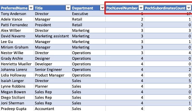
SharePoint Org Chart by Plumsail has just the tool to do the job. I’m going to use the new Export to CSV feature to get the data. What makes it suitable for the task is the ability to provide you with the data on each employee’s level and the number of her or his subordinates. Further on, we’ll explore a couple of ideas for the Organizational Structure Reports in MS Excel.
Here’s how the raw data will look like. Note that you can view much more info on each employee, including, but not limited to phone, office, email, picture URL. We’ll focus on the Title, Department, and two helper fields:
Pivot tables and charts in MS Excel are great tools to analyze your aggregated data. Let’s see if we can get an insight into the distribution of managers by departments in our company. First, we’ll create a pivot pie chart based on the selected data.
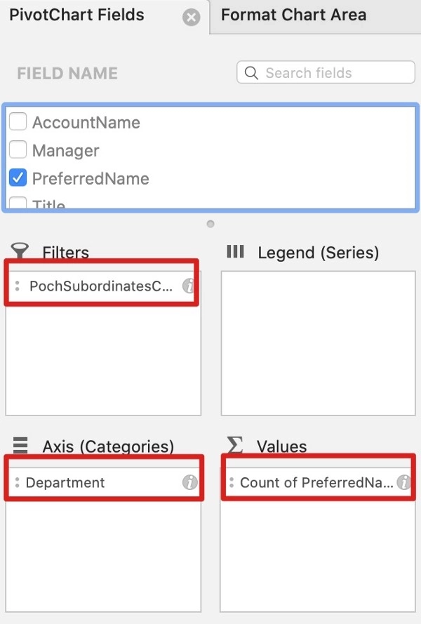
Let’s walk this through.
We’ll need to add Department as the selected Categories.
Then we add one field to count unique employees. In our company, people are uniquely identified by the Preferred Name, but you may wish to use the Email or Account field to get the same result. Note that the Pivot Chart automatically transforms the categorical data such as the Preferred name to the Count type.
Finally, we ad the PochSubordinatesCount helper field to filter out all the employees that have “0” subordinates. That will only leave only managers in the picture.
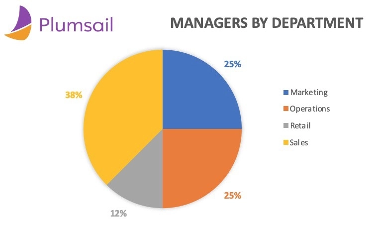
Now we can see that most of our managers are in the Sales Department. Wait, is it a good thing or a bad thing? Let’s try viewing the Managers to Staff Ratio by Department.
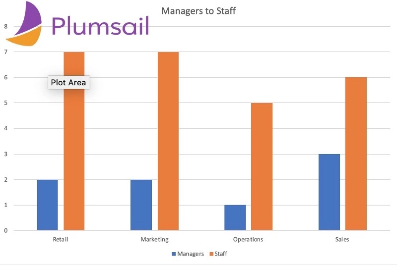
We can see now that the ratio does, in fact, vary by Department. Chances are we can’t go too far from here without a clear understanding of the typical manager’s responsibilities in each department, but it’s nice to have a clear view, especially when your structure is so large and multi-layer that you can’t grasp this data just from looking at an Org Chart.
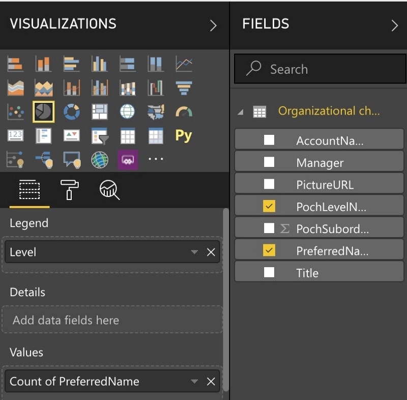
For this part, let’s switch to Power BI, a powerful tool by Microsoft to create reports and charts with minimum data preprocessing. We’ll use the Reports tool.
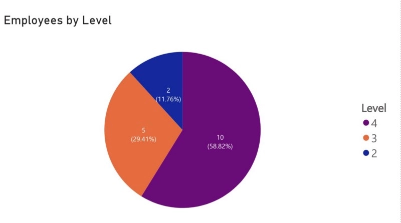
Let’s count our Employees by level. We’ll use the Pie chart once more. To do this, just add the unique field to count by (Preferred name in our case) to the Values field and the PochLevelNumber will be the category in Legend. We also need to filter out the 1 first level as it will always be equal to one and that’s not too informative.
Here’s what we have in a simple structure. You can imagine that it can get pretty complex when your levels grow up to 10 or even 15.
You can combine both ideas above to get an insight into how your employees are distributed both by levels and departments. Here’re a few more ideas:
Just try it for free! Download trial to enjoy your free month.
We at Plumsail are always here to answer your questions, just drop us a message to support@plumsail.com.
Learn how Giunti Psychometrics moved from time-consuming PowerPoint updates to live org charts directly in SharePoint.
Learn how to create custom views in SharePoint Org Chart with options for advanced filtering using JavaScript.
Learn how to create an org chart from Active Directory for Microsoft Teams and SharePoint with this step-by-step guide for easy setup and configuration.