Charts in DOCX templates
With the help of the templating engine, you can create different types of charts based on structured data.
Charts in Word contain embedded spreadsheet data. During processing, the engine reads tags from the embedded XLSX file and renders them just like tags in the Word document.
This article shows a few examples.
Pie charts
In this section, we will show how to build a pie chart in Word using data from a JSON object.
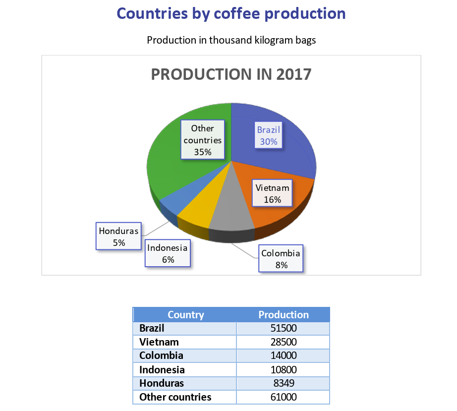
Let’s take an object containing statistics on coffee production by country in 2017. We want to build a simple pie chart that shows the percentage for each country.
You can download the source document and the result document for this example in the pie charts demo. Description of the example is below.
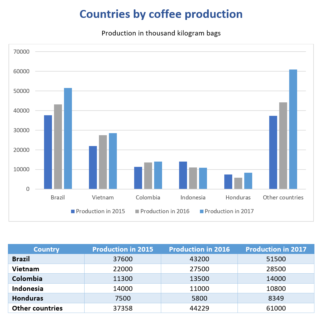
This is how the result document looks:
Template data (JSON):
{
        "title": "Countries by coffee production",
        "description": "Production in thousand kilogram bags",
        "prod": [
            {
                "country": "Brazil",
                "value2017": 51500
            },
            {
                "country": "Vietnam",
                "value2017": 28500
            },
            {
                "country": "Colombia",
                "value2017": 14000
            },
            {
                "country": "Indonesia",
                "value2017": 10800
            },
            {
                "country": "Honduras",
                "value2017": 8349
            },
            {
                "country": "Other countries",
                "value2017": 61000
            }
        ]
}
Now, let’s take a look at the source template:
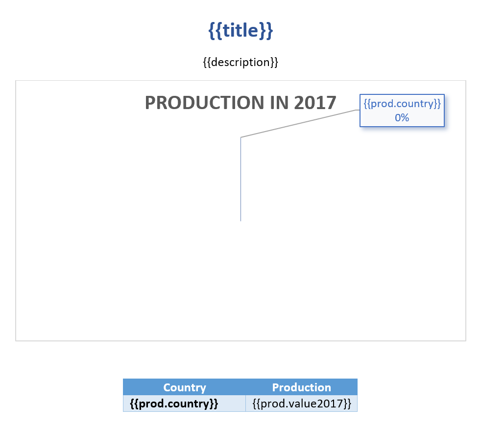
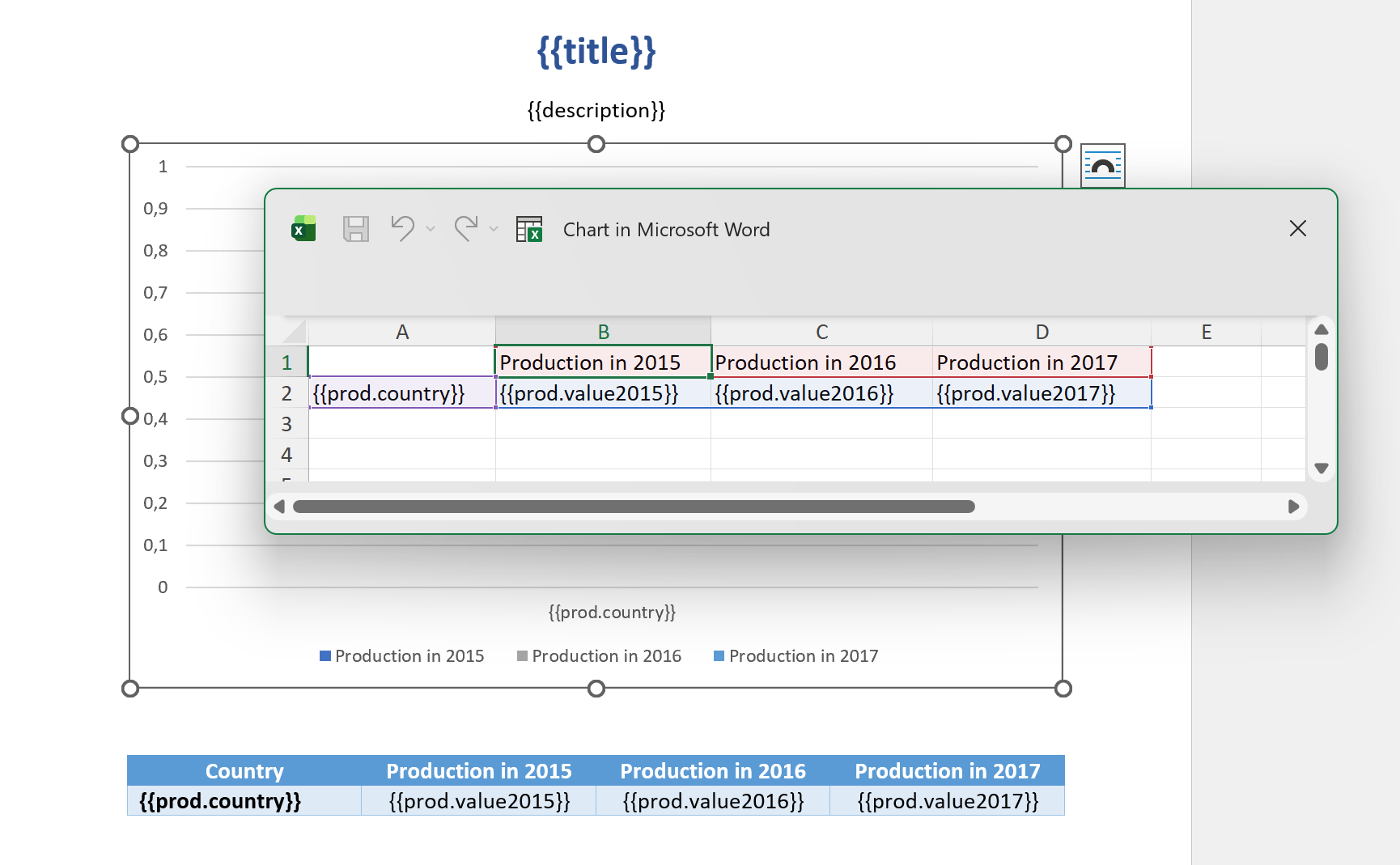
Add {{title}} and {{description}} at the top of the page to render the corresponding properties.
To create a chart in Word, go to the Insert tab, click Chart, choose the chart type, and click OK:

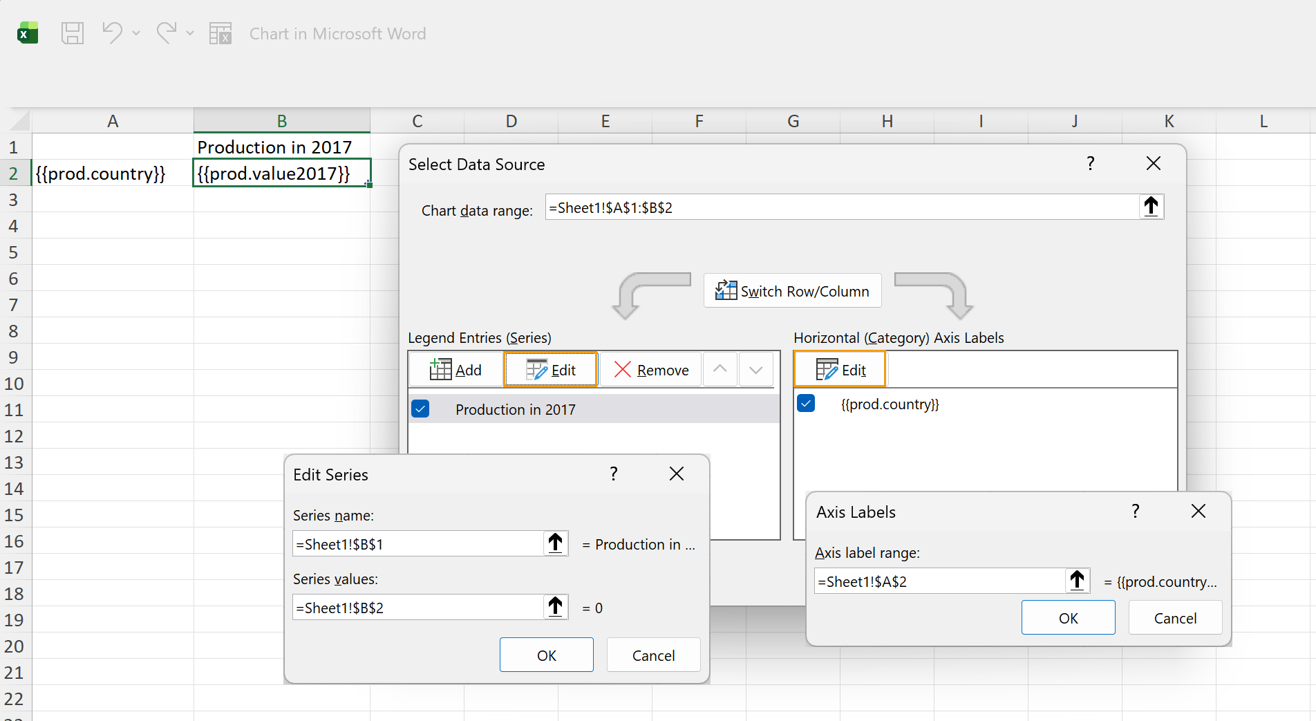
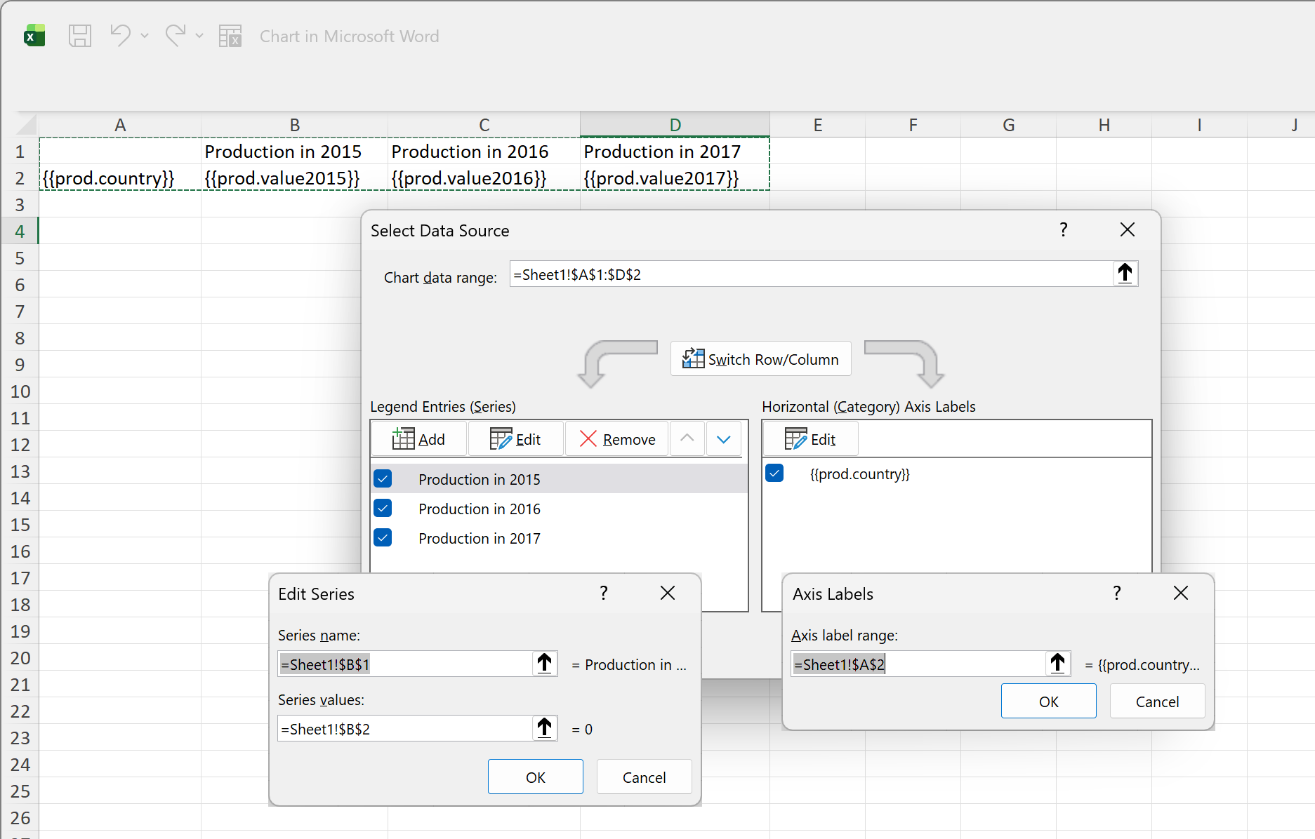
Next, specify which data should be used for the chart. Select the chart, click the Filter icon, and then click Select Data.
After that, edit the embedded spreadsheet and add {{prod.country}} and {{prod.value2017}} to reference properties in the JSON objects. The Series and Labels settings in the Select Data Source dialog box should look like this:
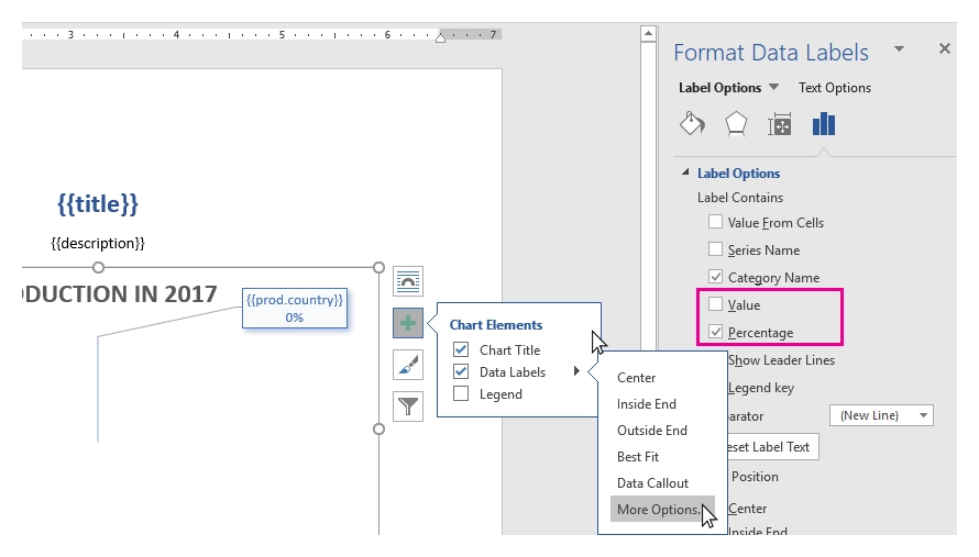
At this point, the chart template is ready. You can also adjust the design and add percentage values to the data labels. Apply one of the default chart styles:
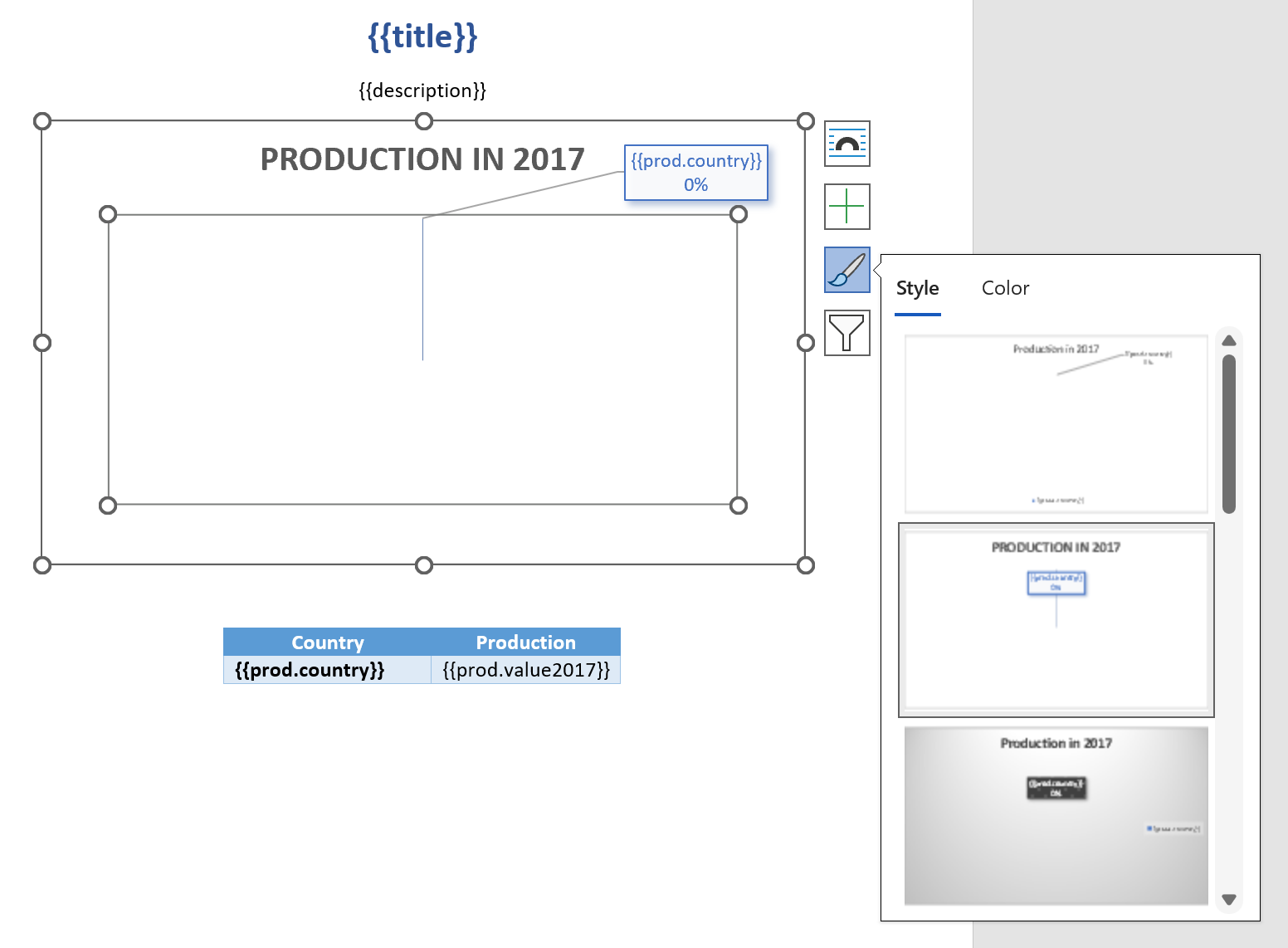
Then open Data Label settings, select Percentage, and clear Value:
The template also includes a simple table under the chart. For more information about tables, see the tables section.
Let’s look at the rendered result once again.
The templating engine automatically creates rows with production data in the embedded spreadsheet and builds the chart based on that data:
Clustered column charts
In this section, we will create a table showing coffee production by country across several years and build a clustered column chart based on it.
Let’s look at an example. You can download the source template and the result document in the clustered column charts demo.
This is how the result document looks:
Template data (JSON):
{
        "title": "Countries by coffee production",
        "description": "Production in thousand kilogram bags",
        "prod": [
            {
                "country": "Brazil",
                "value2015": 37600,
                "value2016": 43200,
                "value2017": 51500
            },
            {
                "country": "Vietnam",
                "value2015": 22000,
                "value2016": 27500,
                "value2017": 28500
            },
            {
                "country": "Colombia",
                "value2015": 11300,
                "value2016": 13500,
                "value2017": 14000
            },
            {
                "country": "Indonesia",
                "value2015": 14000,
                "value2016": 11000,
                "value2017": 10800
            },
            {
                "country": "Honduras",
                "value2015": 7500,
                "value2016": 5800,
                "value2017": 8349
            },
            {
                "country": "Other countries",
                "value2015": 37358,
                "value2016": 44229,
                "value2017": 61000
            }
        ]
}
Now, let’s look at the source template:
Add {{title}} and {{description}} at the top of the page to render the corresponding properties.
To create the chart, go to the Insert tab, click Chart, and choose a clustered column chart.
Then add {{prod.country}}, {{prod.value2015}}, {{prod.value2016}}, and {{prod.value2017}} to the embedded spreadsheet to reference properties from the source data.
The templating engine iterates through the array, renders the values, and adds the rows automatically.
The Series and Labels settings in the Select Data Source dialog box are set automatically and look like this:
Now you can adjust the colors, and the template is ready.
Let’s look at the rendered result once again.
The templating engine automatically creates rows with production data in the embedded spreadsheet and builds the chart based on that data: