Getting started
User guide
- Settings
- Form sets
- Containers
- Controls
- SharePoint fields
- Common fields
- JavaScript
- CSS
- SharePoint form panel
- SharePoint web parts
- Microsoft Teams tab
- Forms versioning
Provisioning forms
Examples
- Ticket management system
- Dynamic form for a user group
- Conference room reservation system
- Discussion within a SharePoint form
- Version history within a SharePoint form
- Organize related docs in libraries and folders
- Duplicate item button for List or Library
- Move new form page to another location
General
- YouTube
- Licensing
- Manage subscription
- Billing and payments
- Privacy policy
- Data protection and security
- Version history (Microsoft 365)
- Version history (SharePoint 2019/SE)
Multilingual support
Navigation between forms
- Generate a link to a SharePoint form
- Redirect user after form submission
- Open edit form by default for a user group
- Open form in a dialog
Generating PDF documents
- Save SharePoint form as PDF
- Generate PDF from DOCX template with Plumsail Processes
- Generate PDF from DOCX template with Word Online (Business)
Integration with Power Automate
How to work with buttons on the toolbar of a List or Library control
In this article, we’ll show you how to work with buttons for List or Library control, adding new buttons, removing or modifying existing ones.
Note
For a practical example of how you can customize List or Library buttons, check out Duplicate item button for List or Library article.
Add a new button to the left
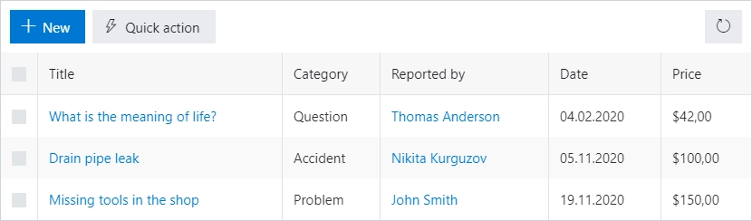
The following code allows you to add a button to the left side of the toolbar, select an icon and run custom code on click:
fd.spRendered(() => {
// new button
let button = {
text: 'Quick action',
class: 'btn-secondary',
visible: true,
icon: 'LightningBolt',
iconType: 0,
click: () => {
alert('Button clicked!');
}
};
fd.control('Control1').ready(() => {
// dt parameter is the same as fd.control('SPDataTable1')
dt.buttons.push(button);
});
});
Add a new button to the left, which is hidden, if no item is selected
The following code allows you to add a button to the left side of the toolbar, which will be hidden until an item is selected and the code sample to access values of selected items:
fd.spRendered(() => {
// new button
let button = {
text: 'Get info',
class: 'btn-primary',
visible: false,
icon: 'Info',
iconType: 0,
click: () => {
let items = fd.control('Control1').selectedItems;
let ids = 'Selected item IDs: ';
items.forEach(item => {
ids += item.ID + '; ';
});
alert(ids);
}
};
fd.control('Control1').ready(() => {
// dt parameter is the same as fd.control('SPDataTable1')
dt.buttons.push(button);
dt.$watch('selectedItems', items => {
if (items.length > 0) {
button.visible = true;
} else {
button.visible = false;
}
});
});
});
Add a new button to the right
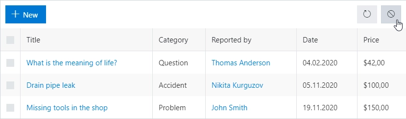
The following code allows you to add a button to the right side of the toolbar:
fd.spRendered(() => {
// new button
let button = {
text: '',
class: 'btn-secondary',
visible: true,
icon: 'Blocked',
iconType: 0,
location: 1,
click: () => {
alert('Button clicked!');
}
};
fd.control('Control1').ready(() => {
// dt parameter is the same as fd.control('SPDataTable1')
dt.buttons.push(button);
});
});
Modify existing buttons
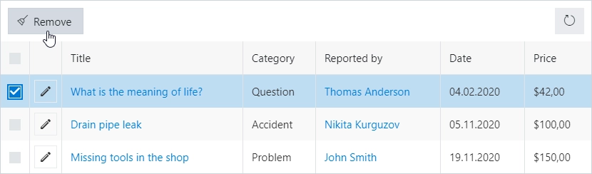
The following samples will allow you to hide, change text or icon for the existing buttons.
You can hide any button, for example, New button, with the following code:
fd.spRendered(() => {
fd.control('Control1').ready(() => {
// dt parameter is the same as fd.control('SPDataTable1')
dt.buttons[0].visible = false;
});
});
Change the text on the Delete button:
fd.spRendered(() => {
fd.control('Control1').ready(() => {
// dt parameter is the same as fd.control('SPDataTable1')
dt.buttons[1].text = 'Remove';
});
});
Swap the icon for the Delete button (the icons are taken from Office UI Fabric Icons):
fd.spRendered(() => {
fd.control('Control1').ready(() => {
// dt parameter is the same as fd.control('SPDataTable1')
dt.buttons[1].icon = 'Broom';
});
});