Apply CSS styles
Plumsail Forms supports Cascading Style Sheets (CSS), which allows you to customize the appearance of the entire form, individual elements, and the target SharePoint list page.
This article provides instructions and practical examples for applying CSS to your forms.
CSS editor
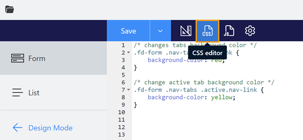
Plumsail Forms designer comes with a built-in CSS editor. It allows you to define global styles for your form and the targeted SharePoint list. To access it, click on the CSS icon in the toolbar menu:
Form
To customize the appearance of your form, choose the Form tab in the CSS Editor:
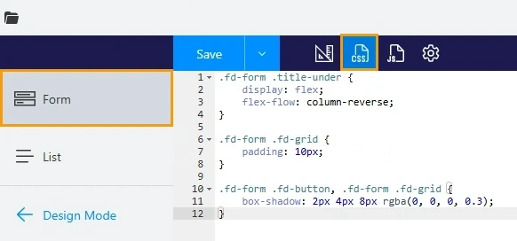
Here you can add rules that describe how elements should look. Selectors determine which elements these rules target. Use developer tools to check which selectors you need, or add a custom class to form elements to select them.
Warning
To ensure your custom CSS only targets the form, always add the .fd-form prefix to every rule.
List
To customize the appearance of the SharePoint list that uses your form, open the CSS editor and select the List tab.
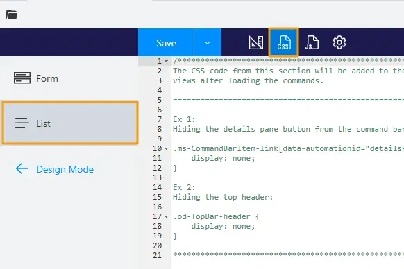
Styles defined here apply to the whole list webpage. For example, this style hides the top bar and changes the color palette of the table header and the list items when users hovers over or selects them:
/* hide the top bar with the site name */
.od-TopBar-header {
    display: none;
}

/* changes table header colors */
div[data-automationid="row-header"] {
    background-color: #0078d4;
    color: #fafafa;
    --ms-semanticColors-infoIcon: #fafafa;
    --ms-semanticColors-listHeaderBackgroundHovered: #2d93e0;
}

/* changes hover and select colors for list items */
html {
    --ms-semanticColors-listItemBackgroundHovered: #e6edf2;
    --ms-semanticColors-listItemBackgroundChecked: #dae8f2;
    --ms-semanticColors-listItemBackgroundCheckedHovered: #cfdce6;
}
Customize specific elements
To style specific elements, use dedicated properties available for all form elements:
Class property assigns one or more custom CSS classes to the form element.
Style property defines an inline style for the form element.
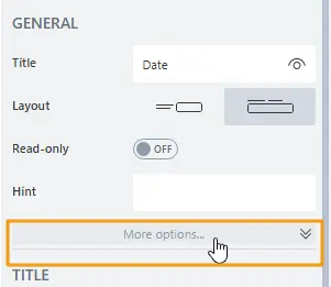
To edit these properties, select the element you want to customize, and expand more options in the General category on the right:
Use custom class
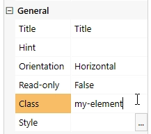
Select the element you want to customize and add the custom class name to the Class property:
Note
To add multiple classes, separate the class names with a space.
In the CSS editor, use this custom class as a selector to target specific elements. For example, add black
borders only to elements with a custom my-element class:
.fd-form .my-element {
    border: 1px solid #000000;
}
Use inline style
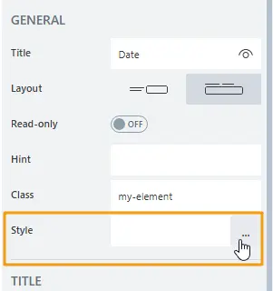
Select the element you want to customize, and locate the Style property.
The property holds a CSS rule that is applied directly to the element as an inline HTML style attribute.
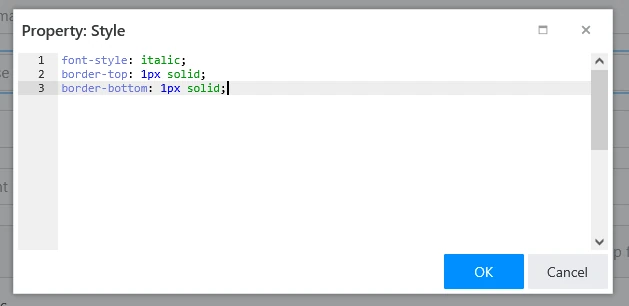
For example, to highlight your field with borders and italic font, apply this inline style:
font-style: italic;
border-top: 1px solid;
border-bottom: 1px solid;
Examples
Below is a set of commonly used styles that you can apply to your forms.
Change background of specific fields
The code changes the background inside the field’s control:
.my-element input {
    background: darkblue;
    color: yellow;
}
Note
This styling applies to Text, Number, Date, and single-choice Dropdown field types.
Change colors of tabs
The code changes the color of tabs:
/* changes tabs background color */
.fd-form .nav-tabs .nav-link {
    background-color: red;
}
/* change active tab background color */
.fd-form .nav-tabs .active.nav-link {
    background-color: yellow;
}
To target a specific Tabs container, add a custom CSS class to it and use that class in your selectors:
/* change tabs background color */
.fd-form .my-element .nav-tabs .nav-link {
    background-color: red;
}
/* change active tab background color */
.fd-form .my-element .nav-tabs .active.nav-link {
    background-color: yellow;
}
Change colors of accordion panels
The code changes the color of accordion panels:
/* style all panels */
.fd-form .accordion-button.collapsed {
    font-weight: bold !important;
    color: white !important;
    background: #1f5945 !important;
}

/* style opened panel */
.fd-form .accordion-button {
    font-weight: bold !important;
    color: black !important;
    background: #f39b07 !important;
}
To target a specific accordion container, assign a custom CSS class to it and use that class in your selectors:
/* style all panels */
.fd-form .my-element .accordion-button.collapsed {
    font-weight: bold !important;
    color: white !important;
    background: #1f5945 !important;
}

/* style opened panel */
.fd-form .my-element .accordion-button {
    font-weight: bold !important;
    color: black !important;
    background: #f39b07 !important;
}
Apply styles based on screen size
Use media queries to apply styles based on screen size. For example, the code applies only to screens wider than 1600px:
@media  screen and (min-width: 1600px) {
    .fd-form .container-fluid {
        width: 800px !important;
    }
}
This snippet applies only to screens smaller than 800px:
@media  screen and (max-width: 800px) {
    .fd-form .container-fluid {
        width: 400px !important;
    }
}
Apply styles on PDF export
The code works when the form is exported to PDF. You can use it to hide elements on the form and adjust styles as necessary:
.k-pdf-export .my-element {
    display: none !important;
}
See the export to PDF guide for more information.